
Over the summer, I started playing with a new (to me) format of data visualisation. I love longform, in-depth analysis pieces. It's part of why I love when the IronViz qualifier competition comes around each year - Tableau Public lights up with scrollytelling visuals that go deep into a topic that someone has poured their heart and soul into. Sometimes, this isn't the right format though. Maybe the story you are telling isn't that deep. Maybe you want to create something short and sweet that doesn't take weeks of research and analysis. Maybe you just want to do something fun that draws on one of your passions.
If you've been on my blog before, or seen much of my work, you will probably have gathered that one of my passions is sports. You may love that and it's why you keep coming back; you may hate it and resent me for having interests that don't align with yours; you may be utterly indifferent. That's not the point. The point is, I created a few short visualisations to tell very specific stories. The data was simple. The colours were limited. The size was restricted to what Tableau Desktop calls a Column - 550x1000px. These projects were really just for me. They went on my Public profile but I didn't share links to them anywhere else.
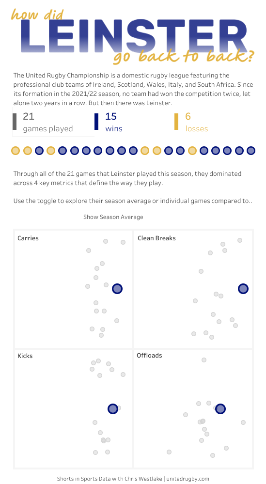
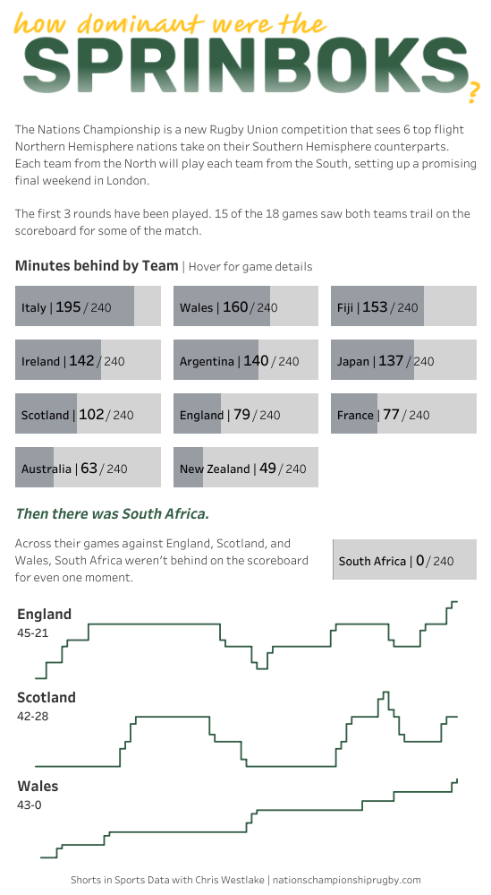
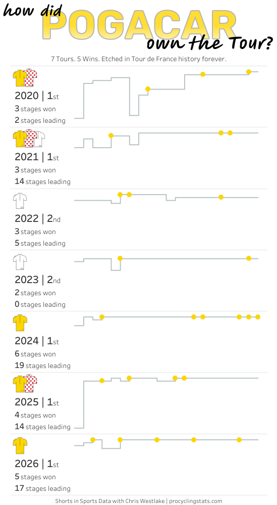
Then I was talking to Rob Taylor... we both miss seeing people posting Passion Projects and shouting about them on Social Media. It's how we both got involved in the Tableau community, and it really helped to bring what we do at work to life in a setting we actually care about. Several conversations later, and Shorts in Sports was born.

What is Shorts in Sports?
This new Community Initiative is designed to be simple. We will share a small, fun dataset from a sporting event. Your challenge is to show us what you see in it. It may be a single match, a race, a tournament, or simply a standout performance or moment. The data will always be bite-sized on purpose. We know everyone is busy and so many things are competing for your time. With Shorts in Sports you should be able to jump in, explore, and build something without needing to cancel plans for an entire weekend.
There will never be a right answer. One person may build a clean, minimalist view of the key moment; another may go all out on design and bring the atmosphere of a stadium to their viz. We want to see many approaches to tell the many stories that even a small dataset can contain.
How to get involved
Download the data from GitHub or Tableau Public
Create your viz
Publish it to Tableau Public
Share it with the community using #ShortsInSports
That's really all there is to it. Now let's begin...
This week's data: English Premiership rugby
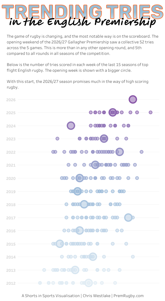
This week we are sharing data from English Premiership rugby which kicked off the 2026/27 season last weekend. England's top 10 teams play each other twice over the course of a season, and this year it really could be anyone's to win (except maybe Rob's beloved Harlequins...). The opening weekend saw an astounding 52 tries scored in 5 games - more than in any previous opening round of the competition. We have 2 datasets for you to play with. One looks at a minute by minute breakdown of the weekend's games, detailing the moments that defined each game and how the score line progressed. The other is an overview of the last 15 years of Premiership Rugby, with the total number of tries scored in each round of the competition since the 2012/13 season.
Here's my first (official) #ShortsInSports visualisation. What will yours look like?
Take care // Chris